Emotional & psychological anxiety
Insight: students aren't just comparing interest rates, they're managing the stress of a major life change. The cold, institutional UI made that anxiety worse.
Turning a cold, text-heavy loan listing into a trusted global loan assistant for international students, on web and mobile.
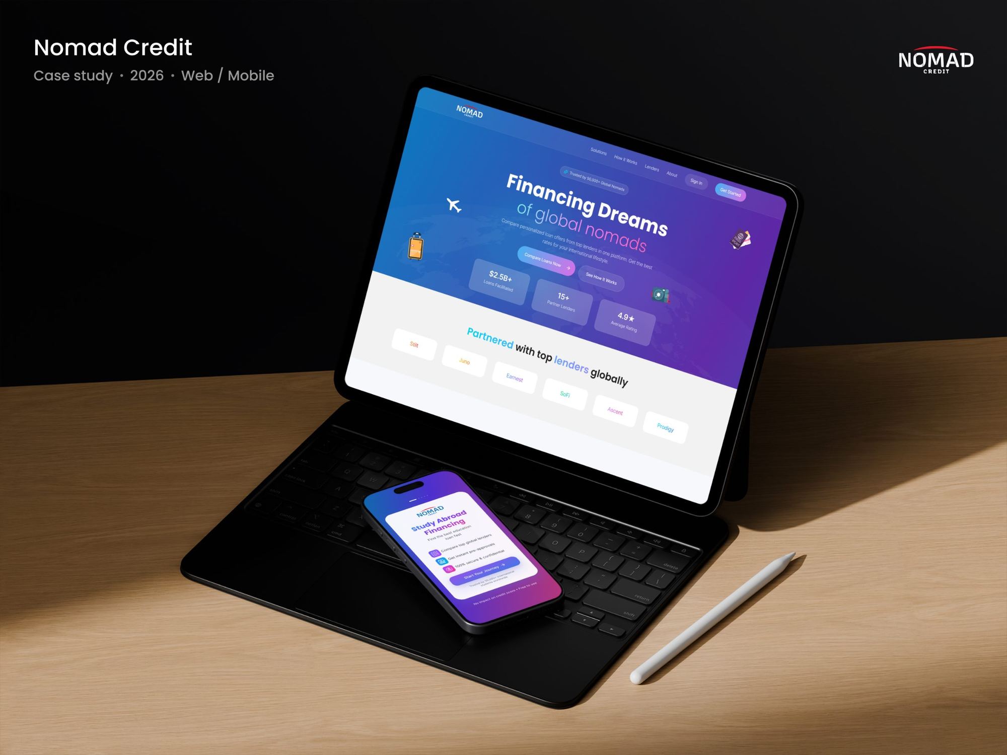
The redesign turns the stress of funding a global education into a clear, empowering financial journey. A crisp, globally accessible UI, human-centred guidance and simple comparison tools replace institutional coldness with warmth and clarity.
The platform positions Nomad Credit as a trusted cross-border companion, so students feel supported, confident and ready to plan their education from anywhere in the world.
International students applying for global education loans face an overwhelming, institutional and emotionally draining process. Across web and mobile, the existing Nomad Credit experience worked as a flat, text-heavy listing platform rather than a guided financial product. That cognitive friction caused severe drop-offs at the most important conversion points.
Loan options read like a directory. Key numbers were buried in copy, forms were long on mobile, and the document upload step gave no feedback, so students gave up right when they were closest to applying.
Transform Nomad Credit from a passive, intimidating listing directory into a trusted, supportive and seamless global loan assistant that cuts application friction and speeds up conversion.
Drag the slider to compare the legacy experience with the redesign.
To avoid building on assumptions, I ran a deep-dive research phase that balanced the needs of students with the goals of the business. Cross-referencing student insights with the commercial goals of cross-border finance stakeholders showed exactly where the legacy platform was failing.
Worked with product managers and business development to find operational bottlenecks. The business needed more lead-to-application conversions, while backend teams saw incomplete document uploads stalling lender approvals.
Insight: students aren't just comparing interest rates, they're managing the stress of a major life change. The cold, institutional UI made that anxiety worse.
Insight: APR, processing fees and moratorium terms were hidden in dense copy, so students opened multiple tabs or spreadsheets to compare offers by hand.
Insight: no real-time feedback, no progress bar and no reason given for each document. This drove the 42% drop-off at the KYC and upload stage.
felt completely overwhelmed by financial jargon, like fixed vs variable APR and moratorium periods.
preferred applying on mobile but abandoned existing tools because the forms were poorly optimised.
said prominent bank partner logos and verified student reviews were the #1 trust factor.
Rahul balances a software engineering job with planning his master's abroad. He wants loan options with clear financial breakdowns and comparisons he can trust.
Rahul thrives on upskilling and career growth. Between a demanding job and university admissions, he shortlists international master's programmes, looks for vetted funding with competitive rates, and needs clear fees and processing timelines for a smooth move abroad.
A frictionless micro-step flow and clean comparison tools cut choice friction, moving document drop-off from 42% to 15% and driving a 35% lift in lead-to-application conversion.
A premium visual overhaul and real-time status tracking build instant international trust and cut support tickets by 25%, while speeding up approvals and empowering B2B channel partners.
GoalAccelerate the move from casual browser to active loan applicant.
Replacing complex multi-input forms with minimal inputs, icon-based profile cards and predictive sliders removes the friction that triggers form abandonment, directly lifting top-of-funnel conversion.
GoalDecrease the volume of repetitive questions reaching the support desk.
An intuitive document checklist, real-time application status and plain-language tooltips for financial terms tell students exactly what to do next, removing the anxiety that makes them contact support.
GoalEstablish Nomad Credit as a premium, credible cross-border financial brand.
A premium purple-blue fintech palette, prominent partner logos and high-impact testimonial cards give students psychological safety while they make a high-stakes financial decision.
GoalKeep students loyal across a multi-year academic journey.
Turning the dashboard from a temporary listing site into an active financial companion keeps users engaged after approval, opening the way to products like student forex or global bank accounts.
GoalHelp B2B partners and study-abroad consultants submit and track leads easily.
Clear data visualisation and shareable loan comparison links let partners confidently recommend Nomad Credit, driving high-volume organic distribution.
GoalReduce the days between application and lender approval.
Comparison cards with a clear hierarchy, showing APR, term and payments up front, help students decide faster and send clean applications to lenders with no back-and-forth.
A purple-blue fintech palette and one geometric, globally available typeface. Prominent partner logos and testimonial cards give students the psychological safety a high-stakes decision needs.
A geometric sans-serif, free and open source on Google Fonts, so it renders consistently for students in every country and on every platform.
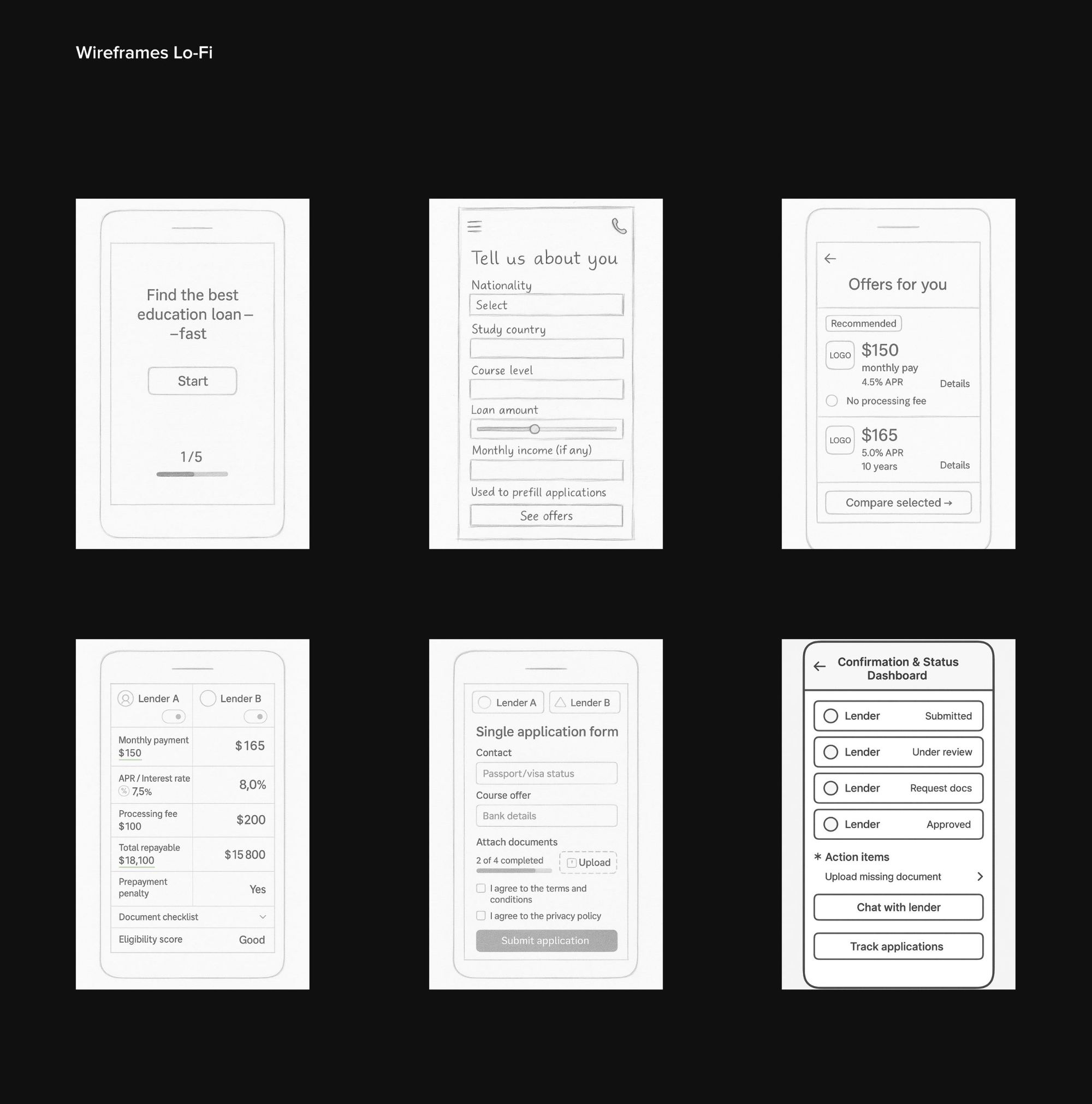
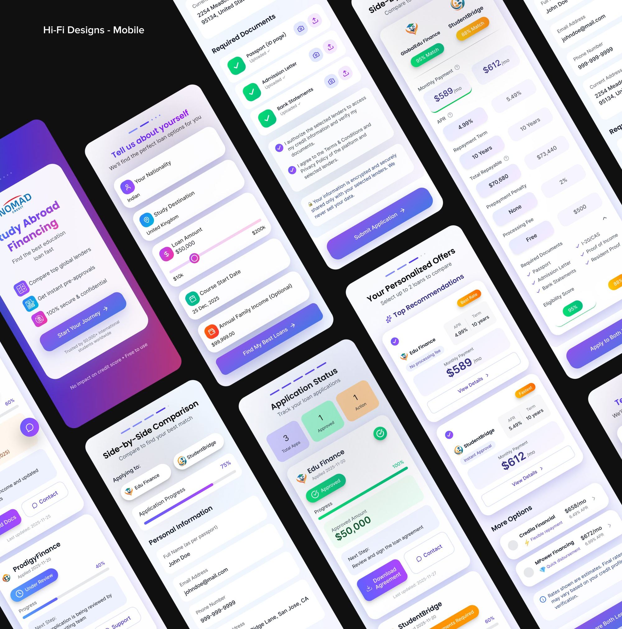
A short profile with sliders, personalised offers, a side-by-side comparison of up to two lenders, one application to both, and a live status tracker that says exactly what to do next.
The new website leads with trust: partner lenders up front, comparable loan cards with APR, amount and term, a four-step "how it works", and a clear Nomad vs traditional comparison.
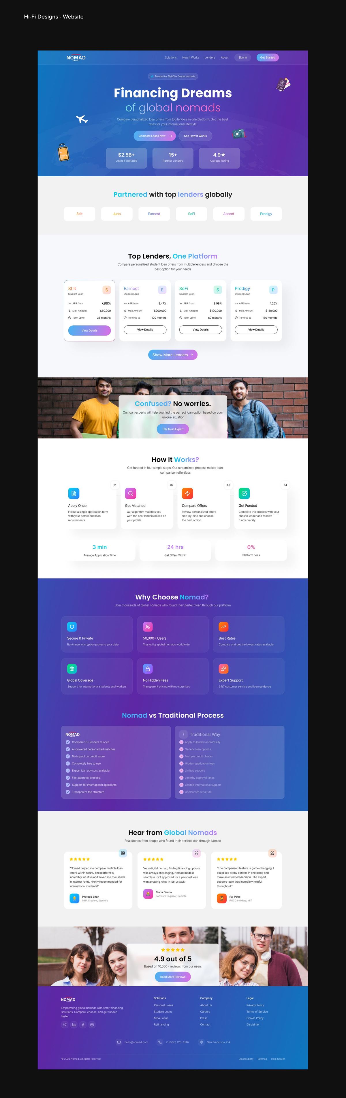
4 weeks · Web + mobile. The main pieces of the final design:
Building something similar? Tell me about it →